What is Cliff Cycle?
Problem
Solution
Cliff Cycle is an e-commerce site that sells upscale bikes for cycle enthusiasts.
Many users on Cliff Cycle are abandoning the site after browsing several bikes. The product manager hypothesizes that users find it difficult to locate the right bike due to the numerous features they need to consider when purchasing a high-end bike.
Another usability problem Cliff Cycle faces is that approximately 70% of users abandon the cart at the registration page. This may be attributed to the requirement for users to register before making a purchase.
Add a comparison feature on the site so that users can purchase an item with ease. Users can have a better understanding of the type of bike that they need when they can view and compare side by side different bikes from each other.
Project Goal
Increase conversion from browse to checkout.
Role & Tools Used
User research
UX Design
UI Design
Wire framing
User flow
Empathy Mappig
Interviews
Prototyping
Testing
Figma
Miro
Branding
Elements & Typography
Colors
Research
Competitor Analysis
To find ways to increase conversion, I researched one of my competitors' websites. Trek Bikes, an industry leader in selling bikes, became the subject of my heuristics analysis to identify what sets them apart from others.
Strengths:
Matches between system and real world
Very easy to browse through
Consistent
Flexibility and efficiency of use
Aesthetic and minimalistic design
Well organized
Uses good quality photos
Weaknesses:
User control and freedom
lack of ways to go back to previous feature when users personalize their bikes
Recognition
there are no options to find recently viewed items
Design
User Flow
The user flow above illustrates the entire process of a user making a purchase as a guest checkout, from the initial stage of comparing bikes, adding items to the cart, to utilizing guest checkout, and finally, completing the purchase.
Wire Frames
Testing & Iterating
I conducted a usability test with five users experienced in online shopping. During the test, I asked them questions about their process of purchasing valuable products. The goal was to understand what motivates users to make a final decision when buying high-cost items.
Emphasize Reviews
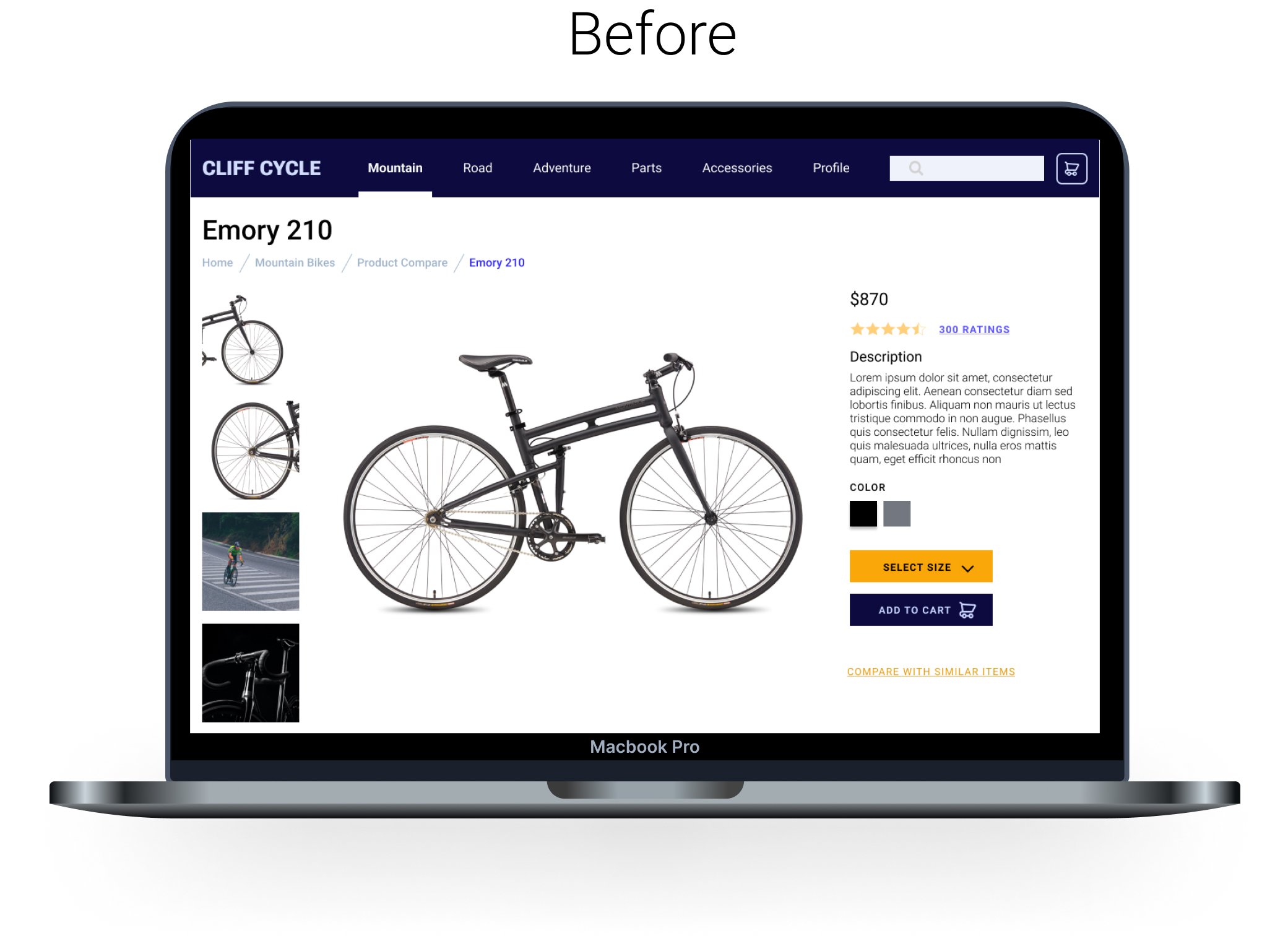
Many users state that reviews play a crucial role in their final decision-making. To enhance this aspect, I have added a hyperlink to ratings, providing users with easy access to all customer reviews.
Add Shipping Cost
Users expressed a desire to view shipping costs and all additional expenses before entering their payment method. In response, I incorporated a breakdown of each cost throughout the checkout process, allowing users to see the total cost in real-time. This enhancement is aimed at helping users finalize their decision to purchase the item.
Refining Designs
Easy to Understand
Following the usability test, users expressed a desire to see more features for comparison, highlighting that reading the entire description took too long. In response, I removed the lengthy description and replaced it with keywords that users commonly look for in a bike.
Features Added
I enhanced the product page by adding additional features such as details, materials, and accessories. This allows users to get a comprehensive view of what comes with the bike.
Breakdown of Pricing
Responding to user feedback, I addressed concerns about cost transparency. Users wanted to know how to save money and were hesitant to enter credit card information without knowing the actual total cost. To address this, I added a breakdown of all costs, visible before entering personal information. Users can achieve this by entering their zip code before proceeding to checkout.
After iterating on my initial high-fidelity mockup, I conducted another moderated usability test with five different users. During this test, they provided additional suggestions for improving the Cliff Cycle website.
Takeaways
To increase conversion, providing users with better incentives to purchase large items is essential. Identifying these incentives is crucial when designing an e-commerce site. Features like adding free shipping or being transparent with all costs from the beginning of the checkout process contribute to making users feel at ease.
Finally, showcasing all the product features using only keywords can assist users in making decisions more smoothly.


