

This project was a collaboration with Bitesize UX, and I used Google Venture design sprint method to complete it. I decided to develop a mobile application called PostUp, catering to freelancers and remote workers, helping them find the perfect cafes to work from. The process began with mapping out the problem and extended all the way through testing the prototype.
Role & Tools
UX Research
UX Design
UI Design
Competitor Research
Prototyping
Testing
Figma
Sketching
Storyboarding
Problem
Finding the right cafe to work from can be a daunting task. While many apps cater to users looking for great coffee, there are few that specifically assist freelancers and remote workers in finding the perfect coffee shop to work from.
Solution
With PostUp, users can discover the best cafes to work freely and boost their productivity. They have the option to filter specific amenities, ensuring they find the most suitable cafes nearby. Whether it's a place for extended work sessions or a spot for a quick in-person meeting, PostUp caters to diverse needs.
Day 1
On the first day, I delved into uncovering the real issues faced by our users. I immersed myself in reading and watching videos related to the challenge brief, diligently taking notes on valuable insights.
One significant challenge users reported was the difficulty in finding an app tailored specifically to their needs, encompassing amenities such as:
fast and reliable Wi-fi
in-cafe restrooms
ample number of outlets
preferred sound levels
proximity to user’s current location
I created a map outlining the potential end-to-end experience that freelancers might have when using PostUp. This preparation was crucial for generating ideas as I approached the next stage, which involved sketching.

Day 2
Lightning Demos


I particularly appreciated a feature in Google Maps—the carousel of images contributed by users showcasing the cafe's ambiance. This feature allows users to grasp the atmosphere of the cafe without the need to take an extra step of selecting a business to explore in more detail.
One of the amenities users seek is information about the noise level in a cafe. Google's time graph is an excellent way for users to gauge how busy the business is in real-time.
I appreciate Yelp's business description page; it is detailed yet easy to understand. Users have the option to view more photos of the business by tapping on the enlarged image.
Sketches
Crazy 8 Sketches

These sketches represent screens that users could encounter while navigating through the app. I took into account the end-to-end user experience map when creating these sketches.

This is my three-panel board solution sketch. I emphasized the business page as the critical screen, as it is where users can make decisions about whether or not they would like to visit a specific coffee shop.
Day 3
Storyboarding

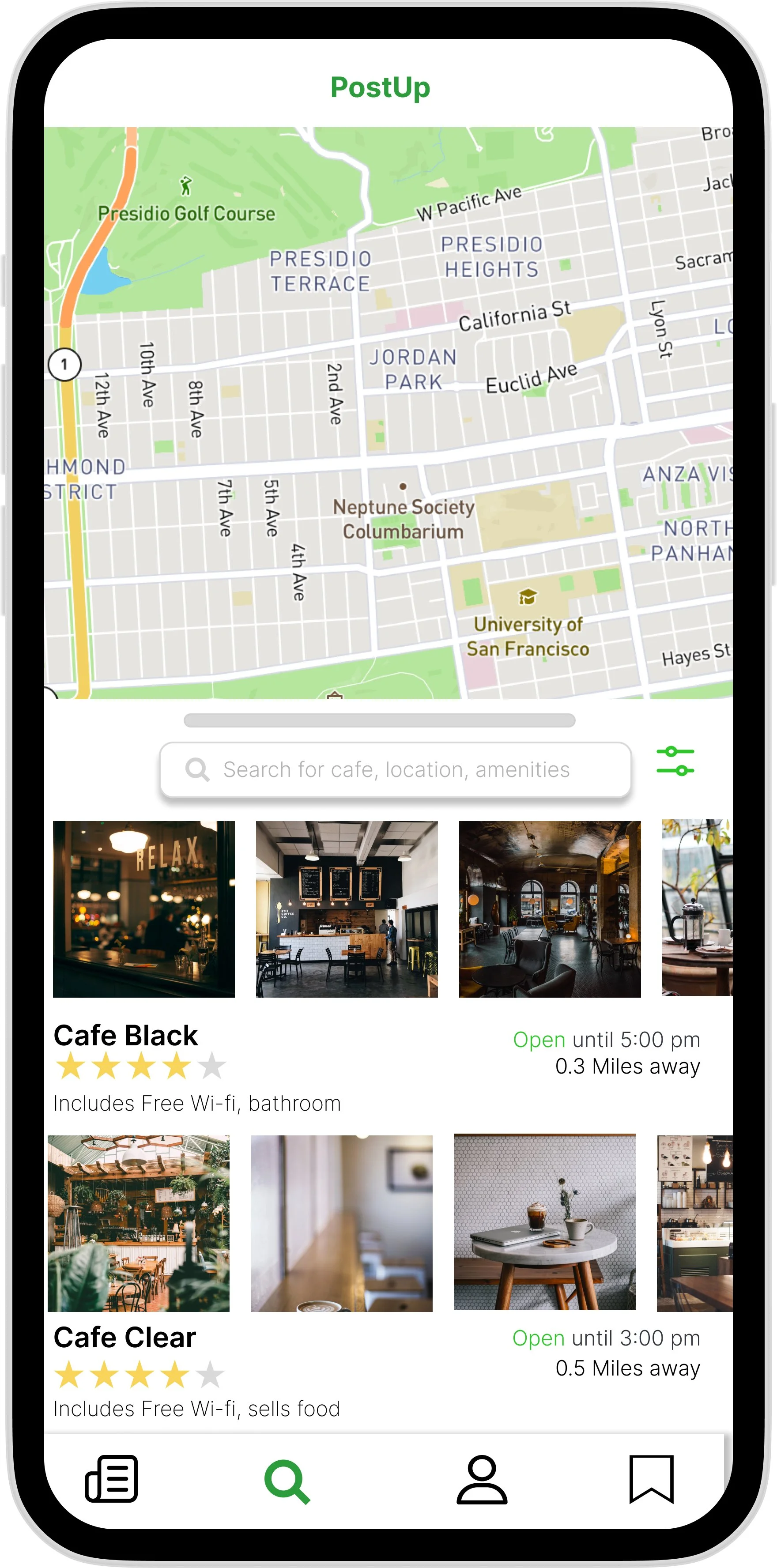
This storyboard begins with users on the map page, displaying all the nearby cafes in a drop-down list. The next frame introduces a filter page, allowing users to select and find the specific amenities they are looking for. After filtering, users are presented with a list of cafes that match their criteria. They can then choose a coffee shop to explore in more detail. By viewing images of the cafe, users can decide whether or not they would like to visit.
Day 4
Build a Prototype


Day 5
User control and freedom to exit:
One usability problem that emerged was users' difficulty in navigating back to the list of cafes near them. To address this, I added an 'x' icon in the left corner of the screen.


Show clear intentions:
Some users were unaware that they could view more photos of the place. To address this, I added a small action text that users can select to see additional images.

I moderated a usability test that consisted of five users who are remote workers and love to work outside of their homes. I have found some great insights and challenges from my users. Some of the common usability problems are:
Text:
One of my users suggested changing the term 'Busyness.' Since it is a subjective noun, my user proposed changing it to 'noise level'.

Add Filter Image Categories:
Users expressed a desire for more control and the ability to filter images based on their preferences. They didn't want to scroll through the entire gallery to find specific photos. To address this, I added categories that align with what users may be looking for.
Key Takeaways
This project had its own challenges; however, it was a rewarding process. I may have missed some small details in my first round of designing, but thanks to my users, I was able to address and change them. My main takeaway is not to be afraid to think outside the box, even when facing time constraints.