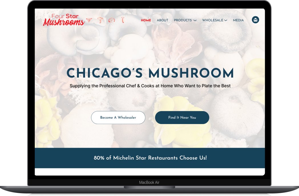
Four Star Mushrooms
With a team of three, I collaborated with our client, Four Star Mushrooms. They are a wholesale business based in Chicago that offers premium specialty mushrooms to personal chefs, restaurants, and directly to consumers through grocery stores in the Chicago area.
Role & Tools Used
Researcher
UX Designer
UI Designer
Competitor Analysis Research
Userflow
Interviewing
Sketching
Wire Framing
Prototyping
Figma
Google Drive
Problem
After meeting with our client the three main problems we discussed were:
How might we…
...highlight the premium nature of FSM products throughout their website?
...refresh the website with a minimalistic design while building users' trust for Four Star Mushrooms?
...showcase FSM’s sustainability and eco-friendly values to potential new customers?
Solution
Re-design the home and about pages to present Four Star Mushrooms as a premium brand with eye-catching values, allowing users to discover and connect with the essence of the brand.
Research & Define
Process
Before embarking on this project, my teammates and I created a project plan for each step of the process. Our objective was to use this plan as a guide to efficiently complete the designs within a four-week timeframe.

Ideate & Test
Design
Research & Test
Research
Competitive Analysis
As a team, we researched and analyzed three direct competitors and one indirect competitor to identify strategies for positioning Four Star Mushrooms as a premium brand. I focused on discerning patterns among our competitors to understand what works well for a wholesaler's website.
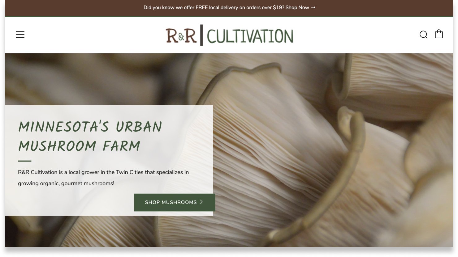
R&R Cultivation
Include and group similar tabs, such as "Where to Buy," "Wholesale," and "About" on the FSM siteIncorporate a map displaying all restaurants nearby that use FSM mushroomsShowcase FSM's value proposition throughout the site, with a specific emphasis on the homepageEnable users to enter their contact information quickly and easily

Mycopia
Develop clearer visual hierarchyAdjust and streamline font style/size structureincrease font size and adjust font weight for improved legibility
Behind the scenes content directly on siteFAQ page
Beneath each website, we listed action items as we observed features from other sites that we could incorporate into our designs for the FSM website. I specifically focused on observing R&R Cultivation’s website, while my teammates observed other sites.

Windy City Mushroom
Highlight our success and promotional events on the homepage (videos, images, podcasts)Offering information about nearby grocery stores, restaurants, and digital shopping sites to assist users (can use maps)To ensure that the tag line is memorable and resonates with users, consider highlighting it prominently

Patagonia
To reinforce our credibility and trustworthiness, we can incorporate Michelin Star chef reviews, restaurant owner interviews, and customer-submitted dish photographs into our content strategyWe can aim to present our founder’s narrative on sustainable farming, our mission and our journey thus far in an engaging, interactive manner that captivates and sustains the user’s interestInclude high quality images of the products to attract users
Heuristic Analysis
Business Website


We conducted another competitor analysis by assessing the usability heuristics of both our competitors and Four Star Mushrooms' website. We rated the heuristics on a scale of 0-4, with four indicating a usability catastrophe. Throughout this process, we identified any violations and made recommendations based on our observations of the designated competitor websites. As a team, we collaborated to rate FSM's usability heuristics.
Heuristics
Violation
Recommendation


Define
Personas
After discussing the goals of the website with our client and identifying their target audience, we decided to create two distinct personas for FSM: one for business-to-business (B2B) users and another for business-to-consumer (B2C) users.

B2B user will include personal chefs, restaurants, catering companies, and grocery stores.

B2C users will include home consumers who can try out FSM mushrooms near by restaurants and grocery stores who are also our B2B users.
B2B User Flow

For this part of the project, my role was to create a user flow for our B2B users. I began with users landing on the homepage and guided them through the process, concluding with them sharing their contact information to become a part of FSM wholesale.
B2C User Flow

B2B User Red Route
Red Routes


B2C User Red Route
Design
Lo-fi Sketching
We individually sketched four different designs for a home screen and four additional designs for an about screen within a total of eight minutes. Following the time limit, we engaged in a discussion to determine which elements from each of our sketches we wanted to incorporate into our group collaboration sketch.
About Page
Home Page
These sketches represent my personal perspectives and ideas for the FSM home and about pages.
Group Collaboration Sketches
Home Page
About Page
These sketches are a compilation of ideas that we combined into one collaborative sketch for the home and about page.
Mid-fi Wireframes & Iterations
We conducted usability tests with three participants to gather insights on our mid-fi wireframes. The primary goal was to understand what users pay attention to when browsing through the three main pages.
Concurrently, we shared our designs with our client to discern their project expectations. After receiving feedback from both users and our client, we made several adjustments to the designs, as outlined below.


Home Page
Reduced size of the banner
User can know now that they can keep scrolling down to see more content
Changed dark background to light background
Addressed user feedback about inconsistency with the color of the about page
Aligned with our client’s preference for a light background
Per our clients request we added an automatic changing image place holder where users can find restaurants that use FSM mushrooms in their dishes
Per our clients request we removed FSM business values and moved it over to the ‘About Page’
About Page
Light baby blue-darker blue banner
At the request of our client, we incorporated their values directly below their mission statement
Removed sustainability and added three new sections: How We Started, Today, and Where We’re Going
How we started: Image with description
Today: User can click on any image or video to view and can read the description that is right next to it
Where We’re Going: Graphic chart next to description
Removed ‘Meet the Founder’ section
At our client's request, we included a video featuring their founder explaining the mission of FSM
Users skipped over ‘The Founder’ and ‘The Rest of the Team’ section
Removed ‘Our Varieties per our clients request
Find Our Mushrooms Page
Icons added
For users accessibility
At the request of our client, we incorporated a search bar allowing users to enter their zip code. This addition enables users to find FSM mushrooms near them
Colors
Suggesting to accentuate the premium nature of the website, I proposed adding a darker blue. With our client's permission, we successfully incorporated it into their brand style guide.
Text, Buttons, and Other Components

High-fi Prototypes & Quotes From Users

Emphasized relationships with many Michelin Star Restaurants around Chicago at the top of the home page to attract users
Personalized FSM relationships with these restaurants by incorporating photos and quotes from each chef
Included an image of each chef's special dish using FSM products to further engage users and provide a visual showcase

About Page
While we were sketching we wanted to add a sticky header and a sticky sidebar to this page for users to easily access each section and category as they scroll through
“I like the sticky menu on the side.”
From our usability test and our discussion with our client we decided to keep “Our Mission” section at the very top of the page
We added a video of the founder explaining FSM’s mission

“How We Started” section includes the origin story of Four Star Mushrooms and a static image of their beginnings.

“Where We’re Going” explains FSM’s future goals and aspirations
It will have static image or a graph

We added a social media image carousel at the bottom of the home page to showcase the most recent posts from FSM
Enhanced user engagement by introducing interactions that users can experience without feeling overwhelmed
Implemented an expansion feature when users hover over an image or video
We decided to include stamp placeholders beneath the social media section, allowing FSM to showcase their unique and reputable certificates to bolster trust and credibility among users

“Our Values” section has four main values that FSM is known for. To reflect its logo, each of their four mushrooms represent one of the four main values.

“Today” section describes and shows the whole cultivation process, current activities, and practices
Once the user clicks on a small image/video it will enlarge and explain its meaning

Find Our Mushrooms Page
Upon landing on the 'Find Our Mushrooms Page,' users will encounter a map, two toggles for grocery stores and restaurants, and a search engine
We modified the filter menu CTA to a toggle CTA, granting users more control and quicker access to the two categories on the 'Find Our Mushrooms Page
“Very easy to use”

We designed the search engine to enable users to enter their zip code, facilitating the location of FSM products near them on the 'Find Our Mushrooms Page'
After a user selects a category and enters their zip code, a dropdown list of nearby restaurants or grocery stores is presented on the 'Find Our Mushrooms Page'
“Best looking screen.”
Home Page
Organized and sorted out the main header for consistency.
Added a newsletter button at the client's request.
Included two CTA buttons to guide the two consumer groups to their designated pages.
“ It looks like they sell to elevated fine-dining restaurants.”

Key Takeaways
Strive to actively listen to the client, ensuring a thorough understanding of their needs and desires.
When creating designs, provide clear explanations to both clients and teammates regarding the rationale behind the chosen elements and layout, fostering a transparent and collaborative design process.
After implementing a few changes, our team, client, and users expressed satisfaction with the new designs. The collaborative effort within the team enabled a smooth delivery of the designs to our client.